
Bounty: Mix and Mashup
How can we combine the uncombinable?
Go to Challenge | 61 teams have entered this challenge.
Team Name:
Tiny Happy People Hacking
Team Members:
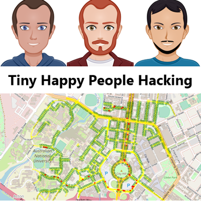
Tiny Happy People Hacking
This project is a visualisation representing the Australian budget by the dollars flowing to different departments, representing the physical movement of dollars on a map-like inferface involving different government portfolio areas.

Built as both Federal government (2017-18 budget) and ACT government (2017-18 budget) visualisations,this is designed as a novel way for the public to visualise and think about the budget.
This prototype focuses on tax monies flowing into the government and being distributed to different departmental/directorate portfolios, with potential, with more time, to model the data by policy theme, or to map the full flow of money from tax income, to agencies then out to various government services and contractors.
We believe that modelling the budget in this way, moving away from graphs (which many people struggle to read), and showing 'live' flows of funding that could eventually be modelled in near-real-time, would help provide a different way for Australians and Canberrans to think about, and consider, how government accumulates and spends money within the economy.
This form of visualisation can provide new insights into where large amounts of money - or small amounts - are accumulating, and help people consider whether they feel comfortable with the government's spending choices.
We used the Federal budget data for 2017-18 and the ACT budget data for 2017-2018 to create two different visualisations to visualise interactively how these budgets are allocated between different portfolios.
We did not attempt to compare the budgetary spending priorities due to the selection of a federal and state budget, however with additional time and effort we could compare different state spending priorities using departmental or thematic policy groupings such that Australians could understand the relative priorities of different Australian state and territory governments, aiding them in understanding both the differences between state needs and challenges, and the differences in policy positions across different jurisdictions (even when government has been formed by the same political party). This could similarly be done across council budgets to show the different priorities of groups of councils and identify underinvestment and overinvestment variations between them without having to look at numbers or graphs.
We believe this visualisation has enormous potential to provide a different view on Australian government spending and help people understand the priorities and choices being made - and maybe identify areas that disagree with, or that require additional public scrutiny.
Description of Use Used to model flows of tax income between tax payers and various government departmental portfolios.
Description of Use Used to model fund flows from tax payers to various agencies in a visually attractive manner.
Go to Challenge | 61 teams have entered this challenge.
Go to Challenge | 7 teams have entered this challenge.
Go to Challenge | 58 teams have entered this challenge.
Go to Challenge | 9 teams have entered this challenge.
Go to Challenge | 8 teams have entered this challenge.
Go to Challenge | 13 teams have entered this challenge.
Go to Challenge | 28 teams have entered this challenge.
Go to Challenge | 5 teams have entered this challenge.